Afresh New Design System
Improving speed with a new design system
Background
We all know design systems can be an important part of any designers tool kit. They can make a major difference in creating a shared language across a team to communicate what UI patterns are available, what spacing elements are used, specific colors that make up a brand, and more. Product harmony, usability, and even beauty can be controlled by a well documented and consistent design system.
At a start-up, the difficult part is determining how important this system is when trying to move really quickly with limited resources and time.
The problem
At Afresh, a series B startup tackling food waste, we ran into this question head-on when we realized our UI patterns and elements were becoming inconsistent as our design system became more and more out of date. No one really knew how to use the current library (established about a year before) and what was what. This was ultimately costing us time and effecting quality.
These were simple. We needed a consistent and visible library, a system that would increase our speed, and more consistent product UI patterns.
Research
How did our design team feel about the current system and what needed to change to make it successful? I began an internal research project that consisted of 8 user interviews with the team, along with a workshop to gather further insights and ideas.
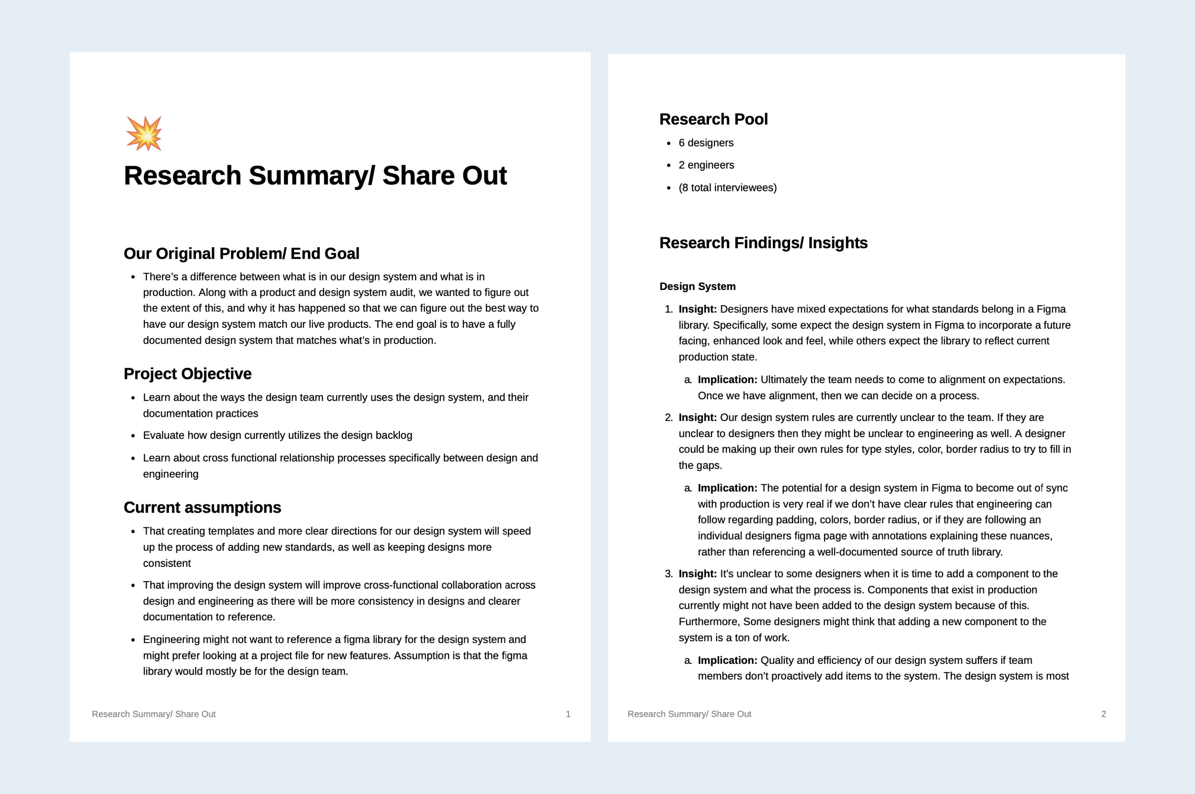
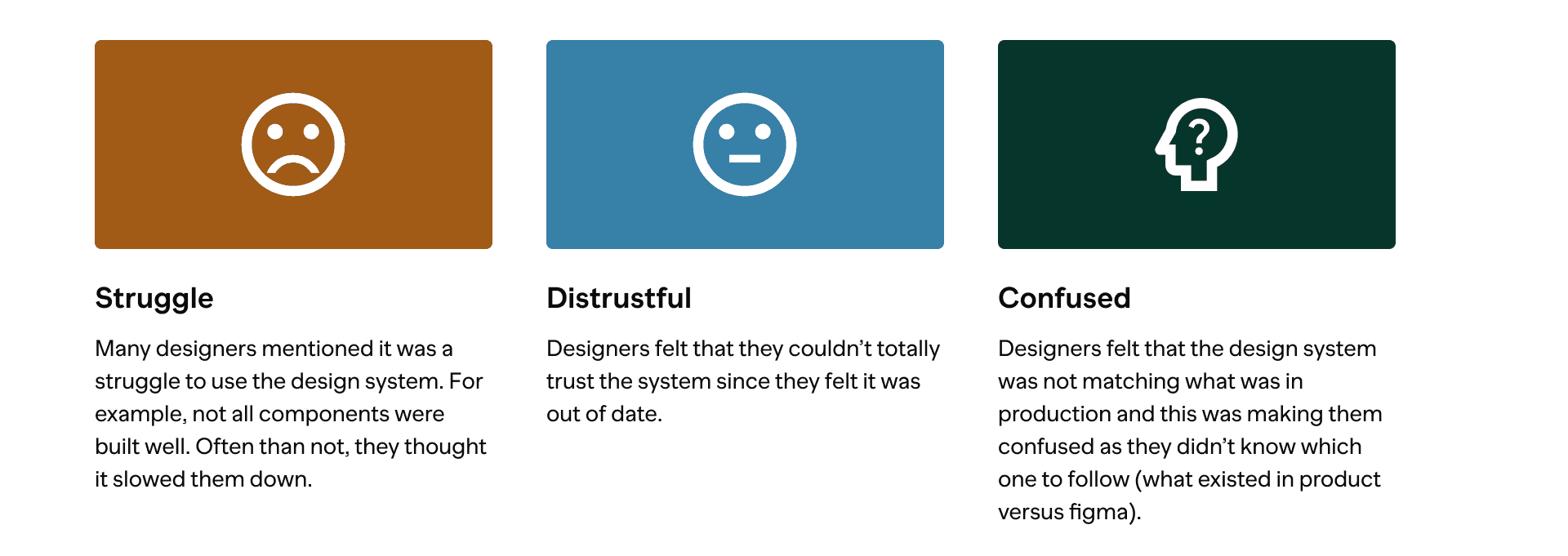
The findings of the interview are summarized below. We found that our designers felt using the system was a struggle, they were distrustful of the system, and often confused by it.

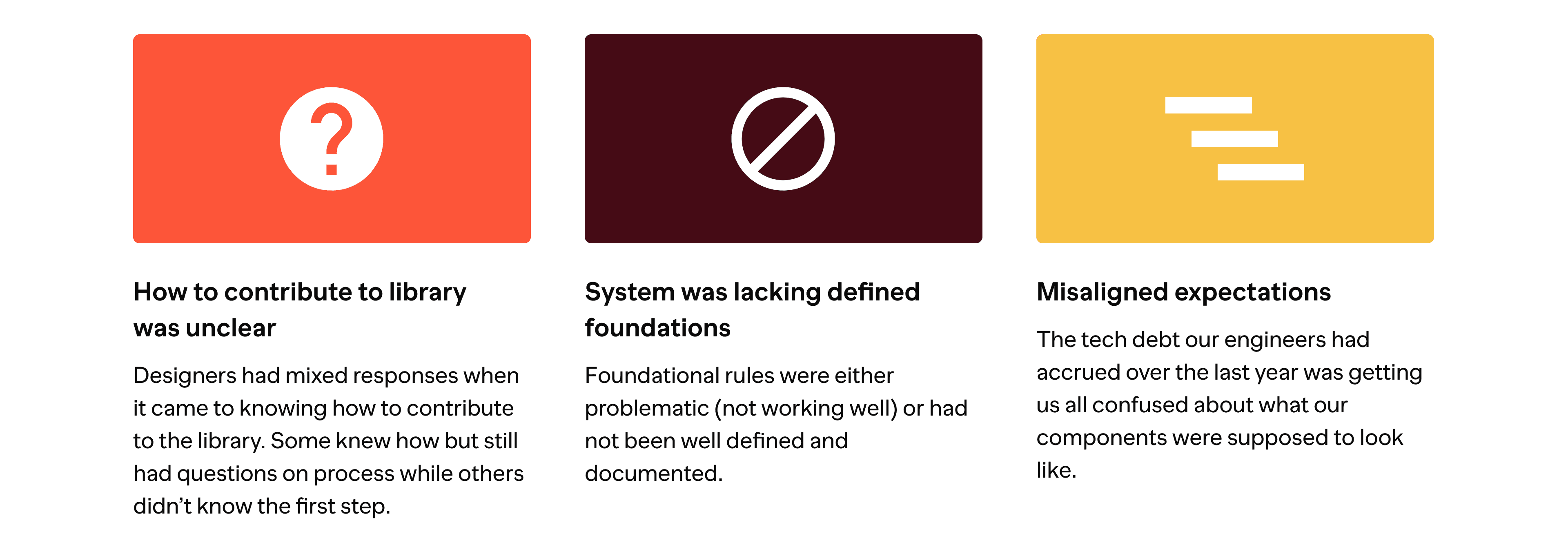
The research insights revealed why that might be. How to contribute to the library was unclear to my teammates, our system was lacking some foundational rules, and we had some misaligned expectations as a result of tech debt that had been accumulating.
Proposed solutions

Auditing
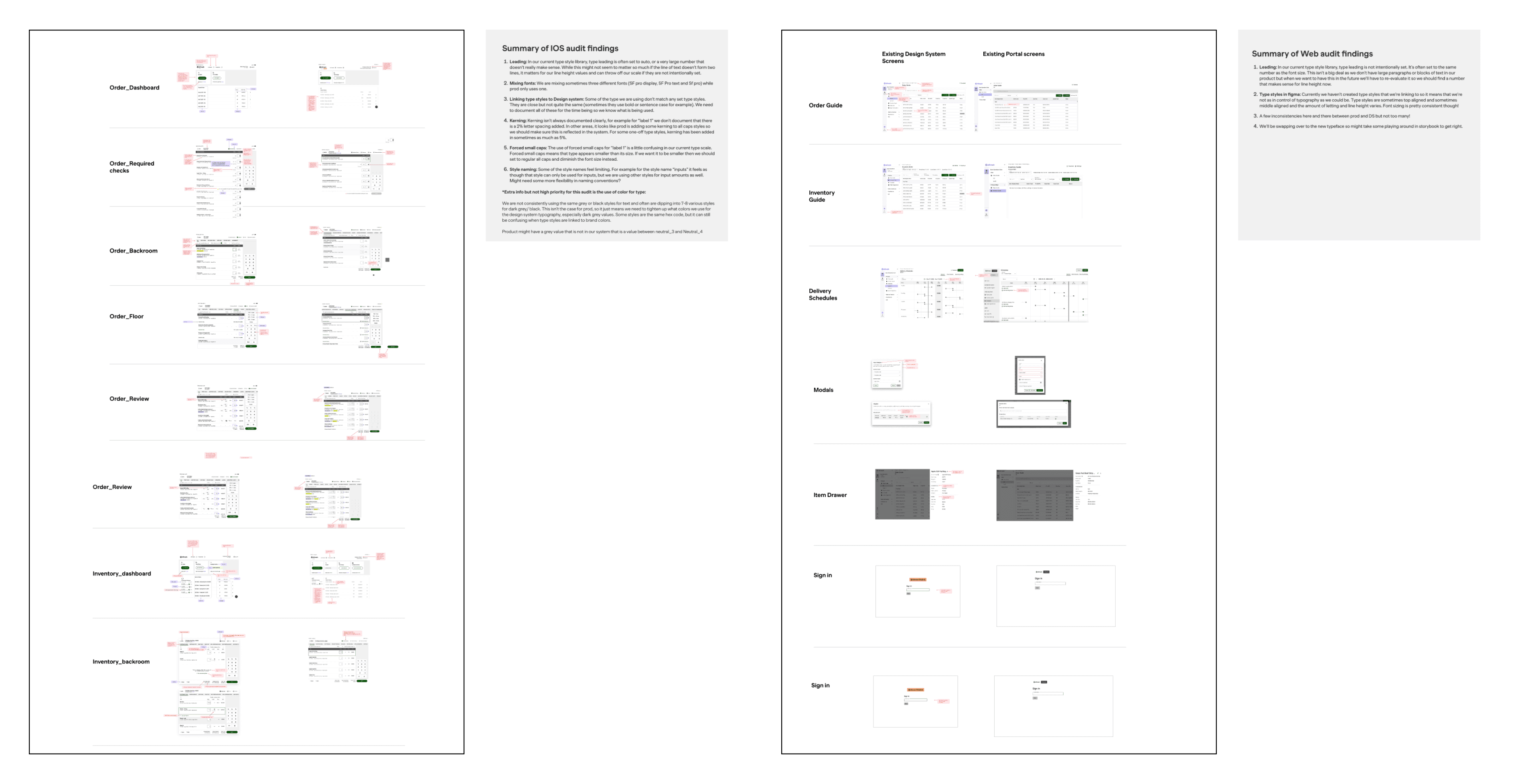
Once we had established our game plan, I set out on completing an audit of our product suite to figure out where any inconsistencies resided.

Designing
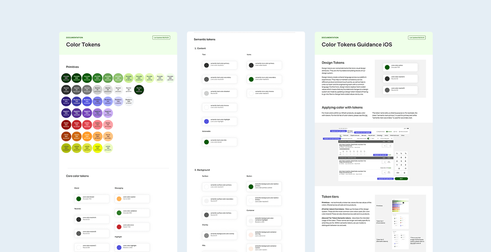
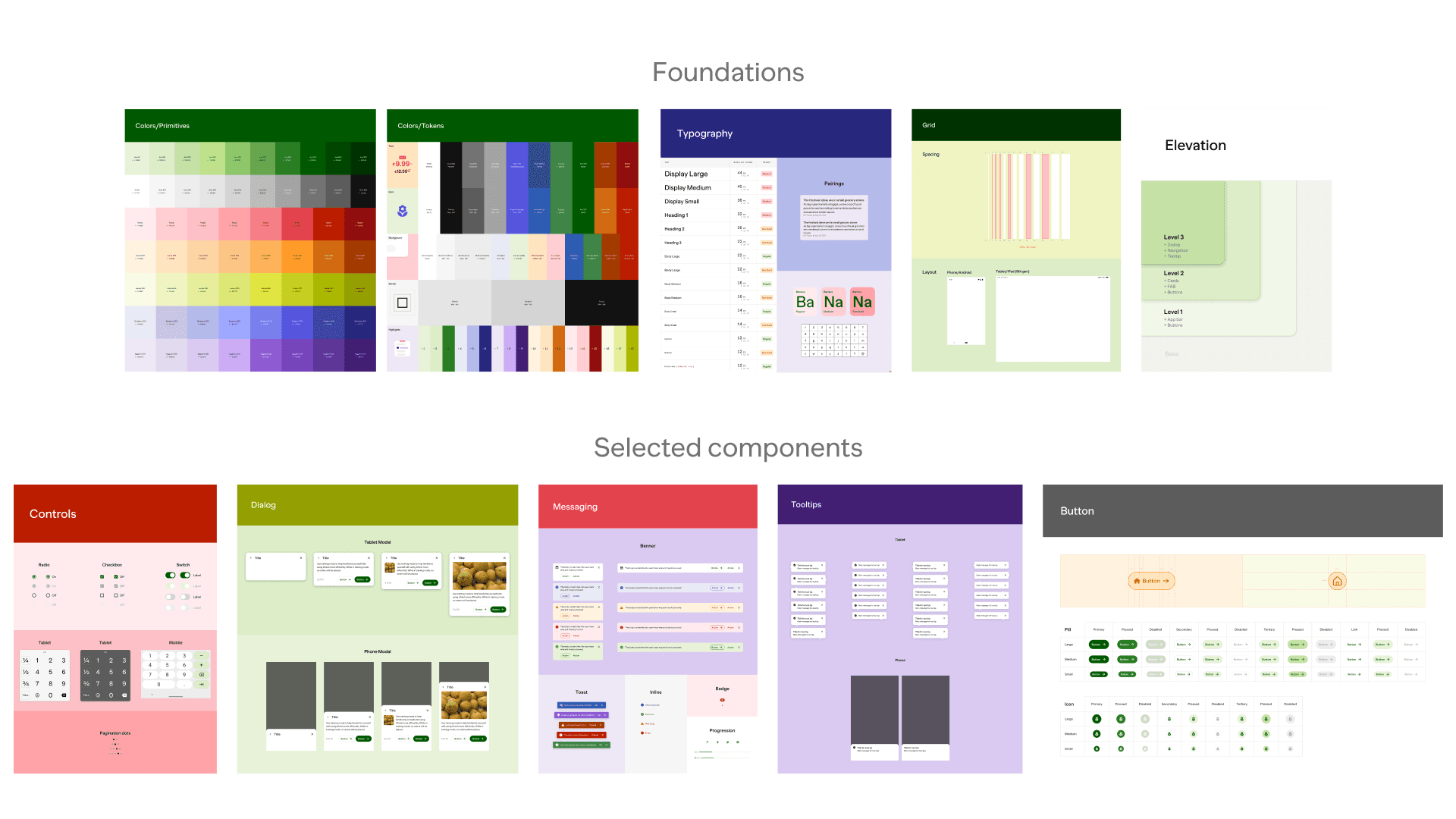
I began iterating on some of the most important core foundations first. This included typography, color, and elevation. Once these were established, I moved on to tackle patterns like tool tips, tags, and modals. Some selected iteration examples below.

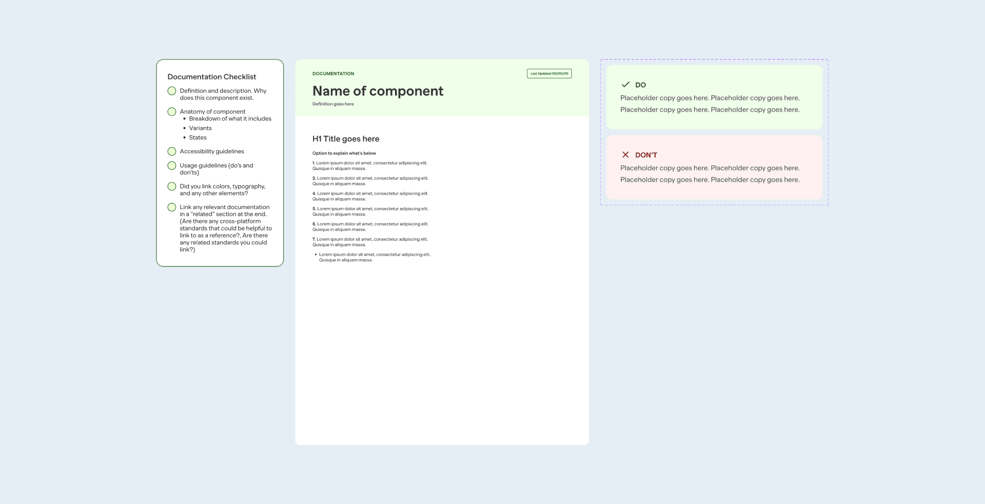
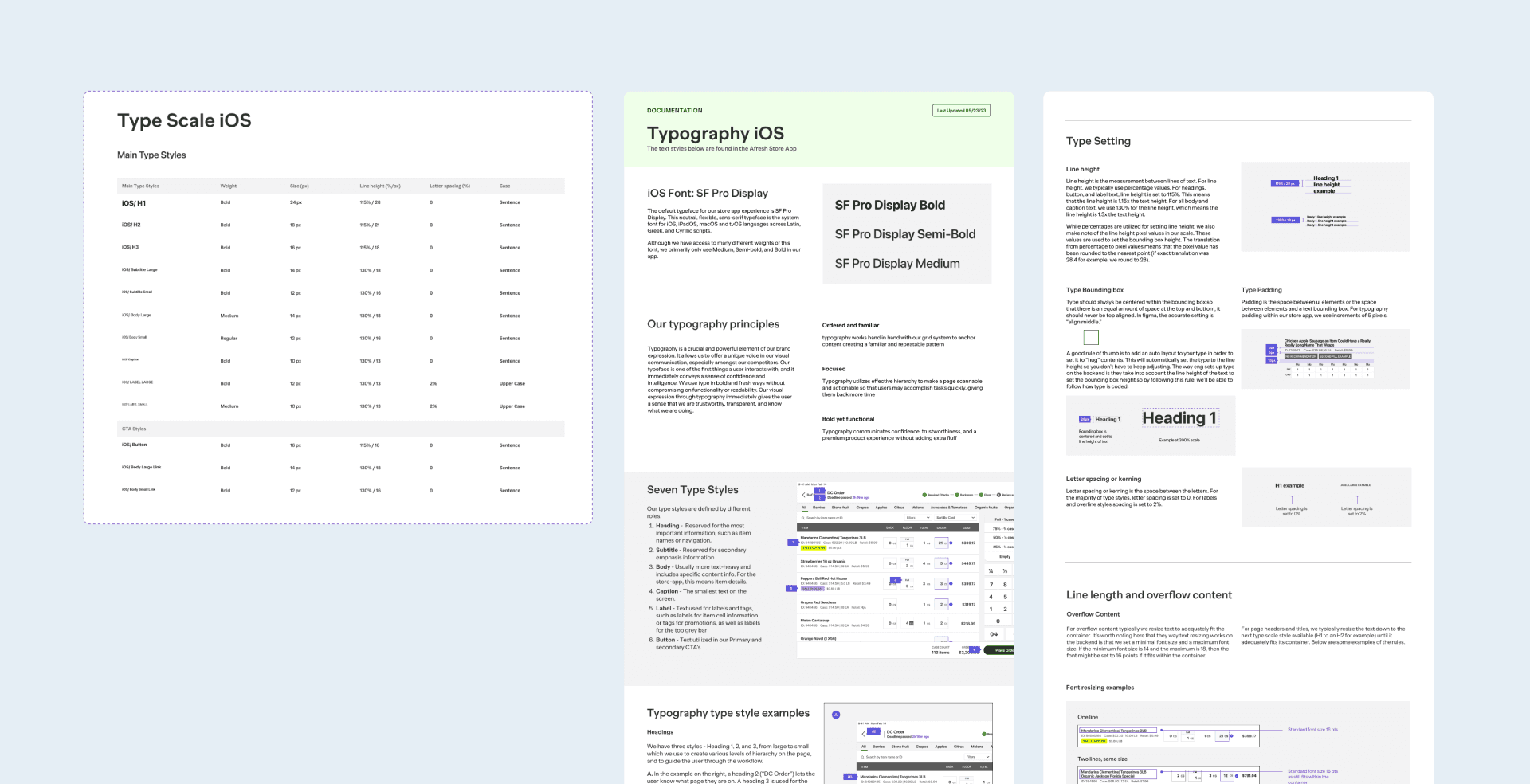
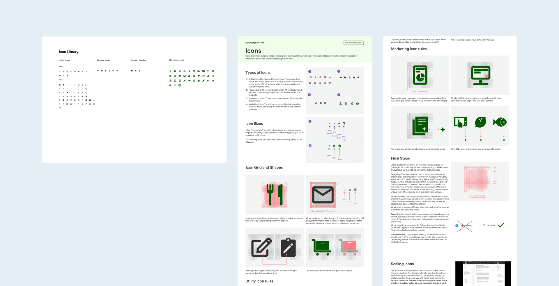
My first proposed template set consisted of a template for the new pattern, along with space and guidelines for documentation. Some examples below of the original template, color, and typography.


Final designs
After collecting feedback from the team and watching designers use the system, we realized that our original designs had way too much documentation that was not being read and was clogging up a clean system. We refined and ended up removing documentation entirely, instead relying on well-built components and strong typography, grid, and color foundations. This worked a lot better as it made our system easier to scan as well as update.


Impact
Sped up designers work to reach aggressive company deadlines
In the past 2 months, we’ve seen an increase in speed of iterating and this has meant our team has been able to meet aggressive deadlines. We built our components using the most up to date Figma features such as auto-layout, variables, and boolean properties so that our teammates can easily design what they need quickly.
Well documented library is improving team efficiency
Because we went back into the system and started from scratch, we have created a robust library our team trusts. This trust has removed designer slow-downs of wondering if the component is up to date etc, increasing efficiency.
Consistent design system foundations and components led to more collaboration
Designers are able to hop in and iterate together from a shared source of truth library. I had a moment in a crit recently when my teammate showed me a design he had created on the fly from a new pattern in the library. His words were "ML, what about this?" It was a layout I hadn't considered and worked well. Without a shared system that we both were referring to, this wouldn't have been as easy to do.
Summary
Strong foundations – color, typography, spacing rules, and grid are key when building a system that is easy to maintain. Once these were established, iterating on more complicated components became easier since we had a shared language we had all agreed upon. We ended up going with minimal documentation because, for a team of our size, it didn't make sense to have rules as robust as some of the well known design systems like Material and Carbon. Since we are a pretty fast-paced start-up, maintaining documentation became pretty unmanageable. We also learned that having 1 or 2 designers to manage the design system was best as having everyone contribute to it became too messy.